Client Showcase: Groovy Hand Lettered Logo and Poster for Livermore Pride Event
This project was so fun! I’m always so happy to work with LGBTQIA companies or non-profits, and this one happened to be right in the town I live in, so it makes it even more special to be part of it.
The Livermore Pride team is hosting an event downtown Livermore this October called Peace, Love, & Livermore Pride. As you can probably tell by the name, it’s 1970s themed, so they wanted the logo for this event to represent that era. The logo will be used for their event marketing as well as special limited edition merchandise. I ended up creating Livermore Pride an event logo, an event poster, and a special design that they’ll be using to create a patch.
I’m really grateful that this team loves my hand lettering style, because a hand lettered/illustrated project is ultimately my favorite kind of project!
Designing the Livermore Pride Event Logo
I always start with inspiration from my clients. I ask them to put together a Pinterest board with images of a similar style or vibe that they’re looking for in their project. I also have them send me any other concepts, images, or inspiration they have that’s not included on Pinterest.
Since they are an established brand I also had them send over their color palette so I could stick within their brand guidelines.
Pinterest Inspiration from Livermore Pride
“LP for Livermore Pride” concept
LP Color Palette (I added the darker blue for more contrast)
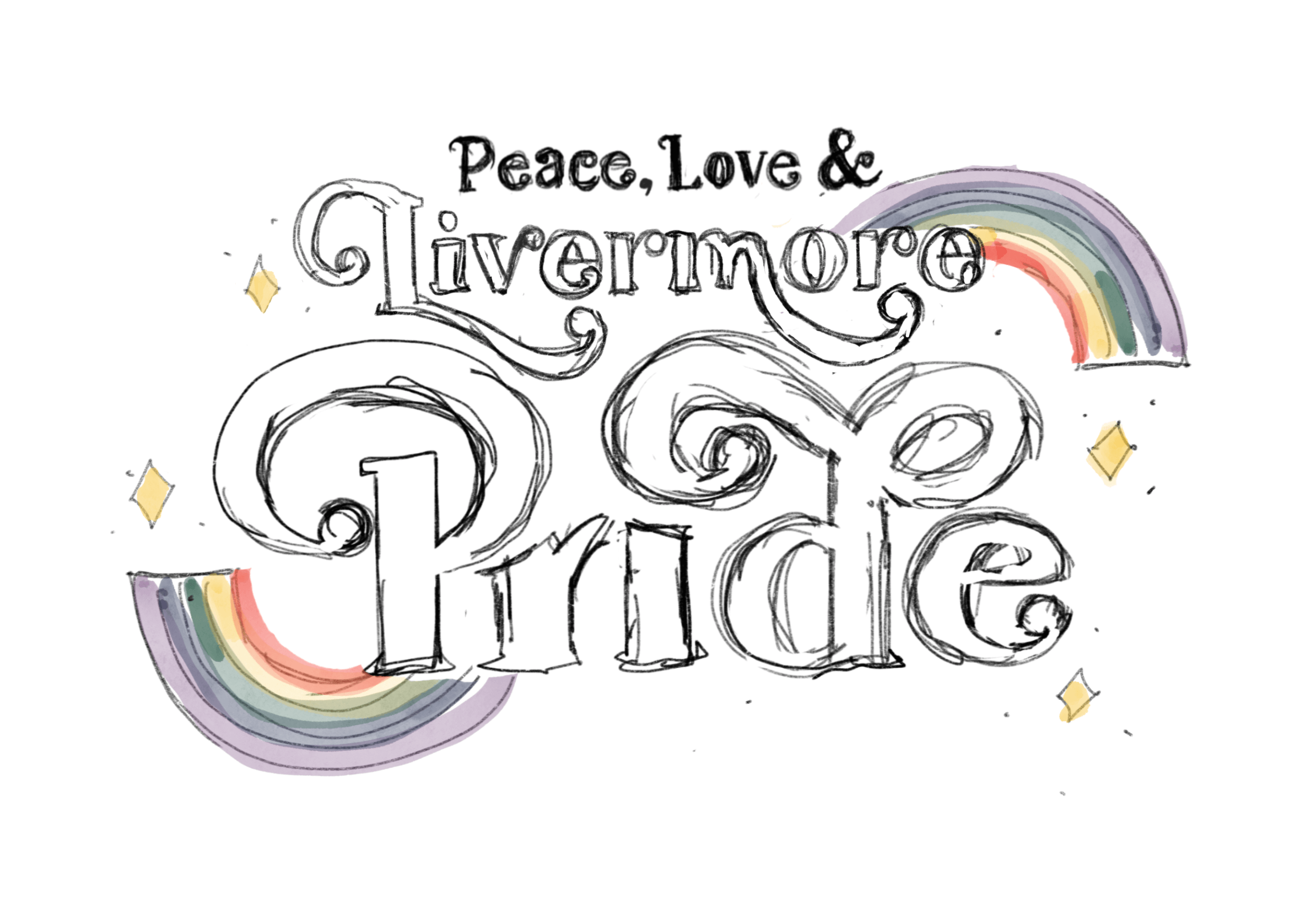
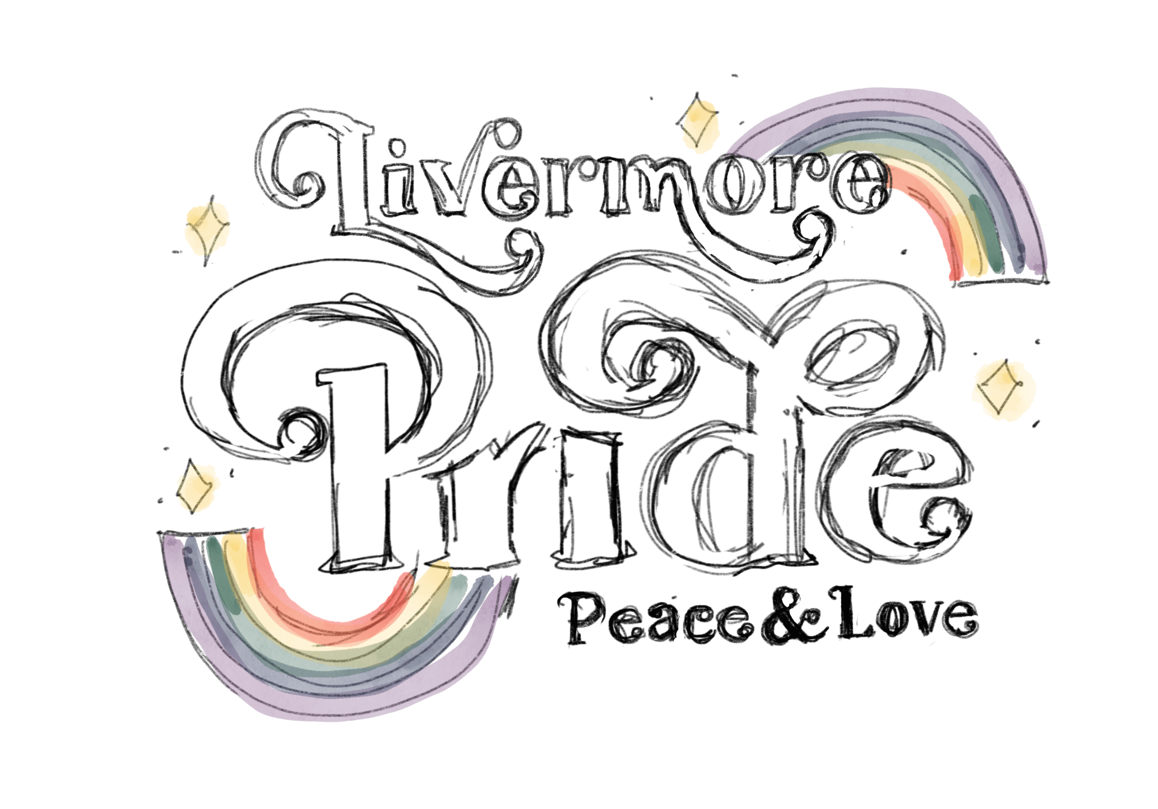
I started with two concept sketches that I sent to the LP team. They wanted the words to read “Peace, Love, & Livermore Pride” but it was a little bit difficult to get the layout right in this order. I created two concept sketches: one with it reading exactly as they wanted, and the other reading a little backwards “Livermore Pride, Peace & Love”.
Pride Logo Concept Sketch 1
Pride Logo Concept Sketch 2
They decided they would like it to read “Peace, Love, & Pride” and then “Livermore” at the bottom. Their other revisions for this concept were to change out the stars for flowers, and to make sure the rainbow had spaces in the middle of the colors as well as have purple first (they use the rainbow in reverse colors for their branding).
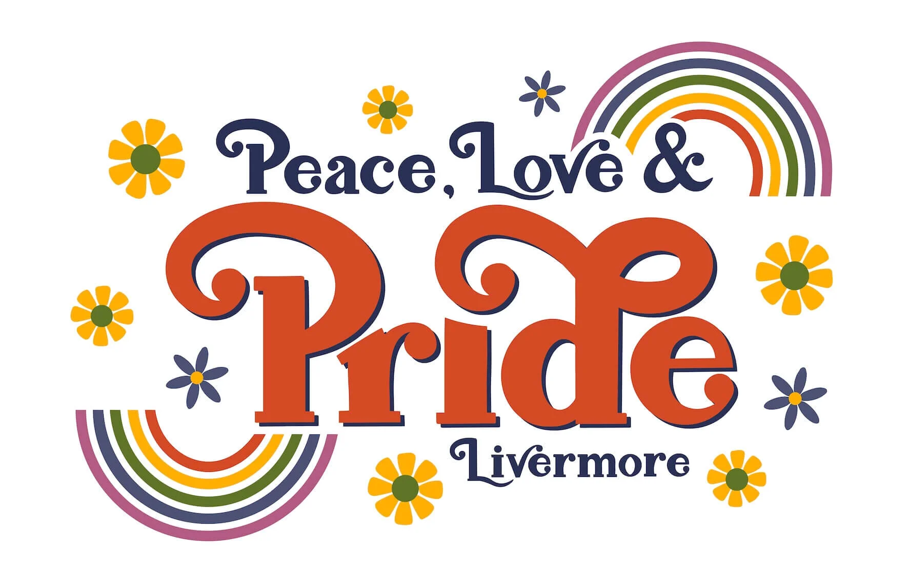
In the end, this is what I came up with. Luckily there were no more revisions after this as they loved the final outcome!
Final event logo for Livermore Pride
“LP” design
Designing the Livermore Pride Event Poster
Designing this event poster was super fun because I had a lot of creative freedom with this. They just wanted it to look 70s themed (you can see their Pinterest inspiration above). I decided to keep everything cohesive so I expanded on what I did for the logo. I created a psychedelic looking rainbow background, created some 70s style flower drawings, and added a hand with a peace sign.
A lot of the festival posters from the 1970s have hippie looking people front and center. While I thought about drawing out a peace loving, sunglasses wearing, long haired woman, I decided against it since this wouldn’t represent the many types of people within the LGBTQIA community. For the purpose of remaining inclusive, I decided to go with a hand giving a peace sign. I used the dark blue so that it didn’t limit me to any one skin color, but more just represented a person in general.
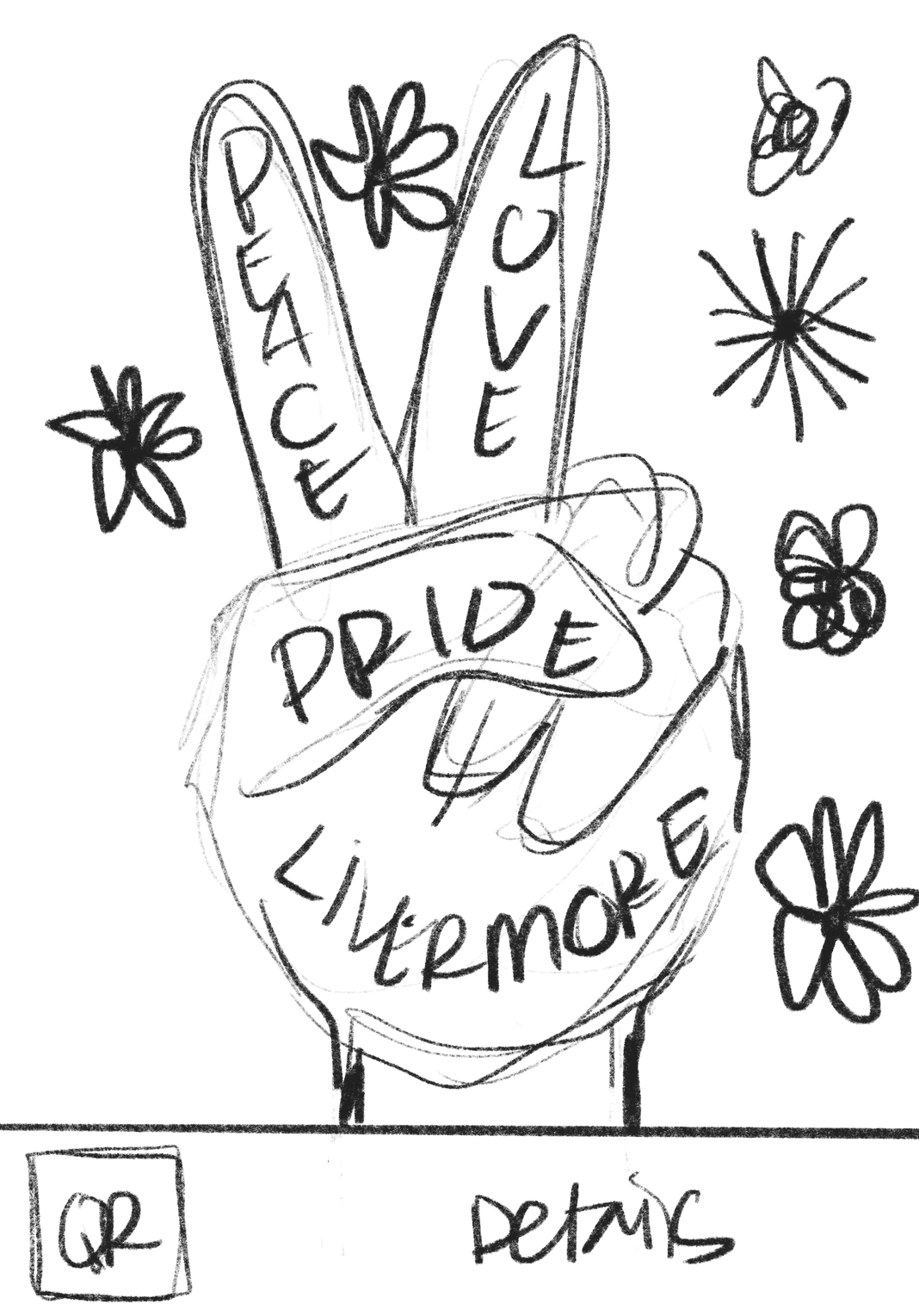
I started with some really, really rough sketches just to get an idea of the overall layout. I do this for any type of project so that I can see it in my mind more clearly. Once this happens I begin creating the background, then the other elements as layers. But sometimes things work out backwards (gotta trust that process!). In this instance, I created the flowers first, then the peace sign hand, and added the lettering from the logo. After playing around with some colors for the background I decided to add the psychedelic looking rainbow background. This is Pride after all! How could I forget to add in a rainbow?
I didn’t want to be redundant with the lettering in both the hand and the title, so I decided to use the lettering on the hand for the patch they’ll be making for the event, and left the hand blank for the poster. It ended up working out beautifully and the Livermore Pride Team was super happy with the final results!
Livermore Pride Fall 2021 Event Poster
Livermore Pride Event Patch Design
Here is a photo from the Livermore Pride Instagram of my designs used on their event merch (t-shirts, stickers, and patches!).
I’m really happy with the way everything turned out for this project, and I’m really glad my client is happy, too! Once they start promoting the event and create patches, stickers, and merch, I’ll update this post with those images.
Here’s to Peace, Love, & Pride wherever you are in the world!
I’m Jenni!
I’m an artist and designer that creates brand identities for boutique, high-value companies. I help these businesses stand out and connect with their target audience by creating unique and impactful logos, branding and websites.


